Parks and Wreck: Mapping the Play Value Gap in New York's Central Park [Reade]
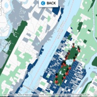
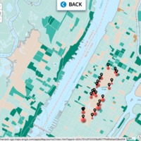
This project takes the form of several iterations of the same map. The goal is to contrast historical renovation efforts of Central Park playgrounds with current trends including median household income, population density, future population growth, childcare spending, racial population, transportation access, and a heat map of public school locations. There are no legends but each census tract contains valuable data: I encourage you to toggle through by clicking on each square and learning about its inhabitants. This element of discovery is intended to make the disparities even more profound. I’ll give you one hint: there are major discrepancies between the area surrounding the north and northeast sides of Central Park (Harlem and East Harlem respectively) and the lower east, west and south sides (Upper East Side, Upper West Side, and Midtown respectively).
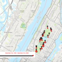
My primary map, and the seven which support it, is intended to demonstrate the play-value gap of the twenty-one playgrounds in New York’s Central Park by contrasting their level of redevelopment with various factors. Redevelopment is defined as significant alterations to the playground’s landscape or equipment, with the first map demonstrating change over time from 1933 to present. The map validated empirical evidence I gathered as a child growing up in East Harlem, where neighborhood playgrounds were often much less desirable than those further downtown. The data, at least regarding sheer number of renovations, proves this. I then decided to visually represent the various questions that arose from this pattern in order to pinpoint what factors could warrant extra attention to playgrounds on the Upper East Side, Upper West Side, and Midtown. These questions included: how wealthy are the neighborhoods surrounding the most redeveloped playgrounds? How dense are these neighborhoods? Are these neighborhoods expected to grow in population in the next five years? How much do parents in these neighborhoods spend on child care (could this effect how reliant they are on public playgrounds)? How white are these neighborhoods? How accessible via subway and car are these neighborhoods? Do the amount of public schools in the neighborhood influence redevelopment? The maps largely lack legends, and for good reason. I firmly believe that toggling through each map’s census tracts and decoding its colors adds an element of discovery that legends largely obscure. My fascination with these playgrounds stems from their conceptualization as sites of literal mobility and play, and I hope my map can reflect that to a certain extent.


